

Ragnar Black
-
Posts
25 -
Joined
-
Last visited
Ragnar Black's Achievements
")


-

Gotham by knight and colour
Ragnar Black replied to Bazman's topic in Batman: Gotham City Chronicles
This is odd, so many ways. :D I assume he is the year 0. But the position of the miniature is weird. :D -
Gotham by knight and colour
Ragnar Black replied to Bazman's topic in Batman: Gotham City Chronicles
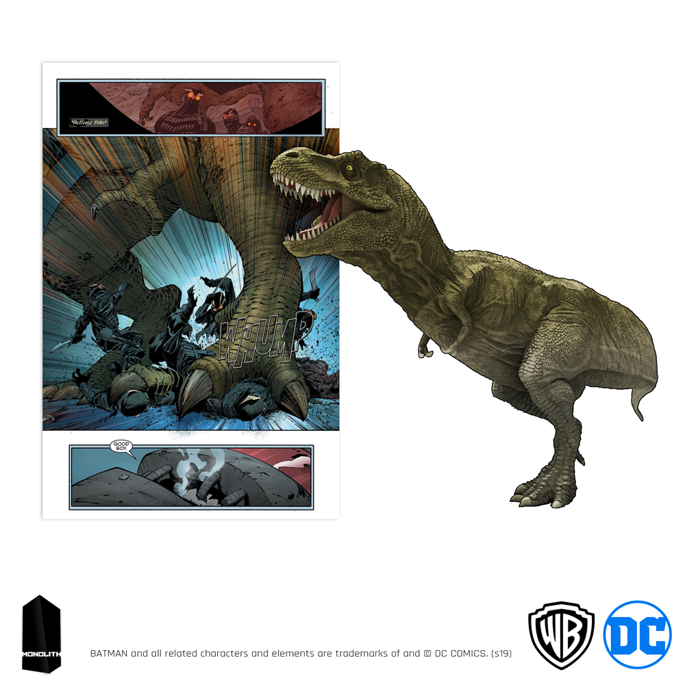
It looks that the shading is getting better and better. Would like to se Batman in this new tone... THE TYRANNOSAURUS OF THE BATCAVE A tyrannosaurus in the basement is certainly an odd thing. It is even more so when the basement in question is none other than the Batcave, the den of a hero who has chosen the bat as a totem. So what is a giant saurian doing in this story?


-
Gotham by knight and colour
Ragnar Black replied to Bazman's topic in Batman: Gotham City Chronicles
Yes it is going the right way and I am happy that they listen to the criticism. And as well maybe adjust the skin colour on Orphan as that is what is it putting a bit off. And maybe add some texture to the render. Hard to tell how it would be on small bad guys tiles, but it may add some on the big character cards. -
Gotham by knight and colour
Ragnar Black replied to Bazman's topic in Batman: Gotham City Chronicles
Ooooo the progress on the cards is a big one. Like this. Good work Monolith -
Gotham by knight and colour
Ragnar Black replied to Bazman's topic in Batman: Gotham City Chronicles
Hmmm the hero card is improved. I believe even the character art is using some new shader?? Am I right? -
Gotham by knight and colour
Ragnar Black replied to Bazman's topic in Batman: Gotham City Chronicles
Hehe there is an elevator to the boat, that is the next tile. Really like this. -
Gotham by knight and colour
Ragnar Black replied to Bazman's topic in Batman: Gotham City Chronicles
Like the mini, although the fire doesn't look like fire. :D Will there be some Red Hood / Red Robin / Batgirl based on The New 52! series? -
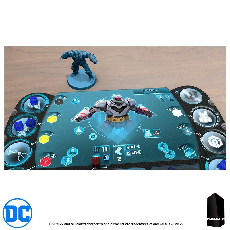
A small tease/preview of the Vilain dasboard
Ragnar Black replied to a topic in Batman: Gotham City Chronicles
Sounds as an improvement.😀 -
A small tease/preview of the Vilain dasboard
Ragnar Black replied to a topic in Batman: Gotham City Chronicles
very nice, good job on this one and good idea with the cubes. -
Gotham by knight and colour
Ragnar Black replied to Bazman's topic in Batman: Gotham City Chronicles
I am faster than Bazman today.. :D I must say that the outcome of this cartoony 3D model tile scheme is the worst from all. Bluish hologram or Comics art was much, much better. I thought that we are aiming on Hush mood and art. Not this..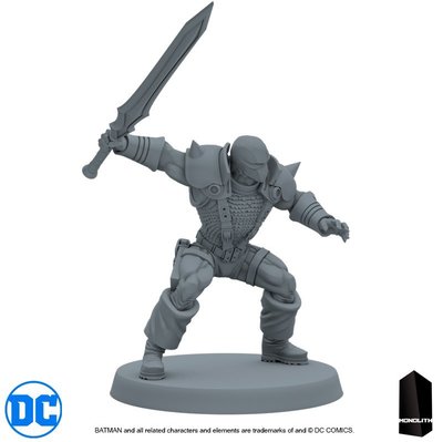


-
Gotham by knight and colour
Ragnar Black replied to Bazman's topic in Batman: Gotham City Chronicles
I must say that I really dont like this new art style...It looks like Cartoons..😭 The hologram was better than this..
-
A small tease/preview of the Vilain dasboard
Ragnar Black replied to a topic in Batman: Gotham City Chronicles
Hmm looks very interesting. What are the difference against the Conan river? -
The miniatures you'd like to see next
Ragnar Black replied to Matt John S's topic in Batman: Gotham City Chronicles
Ra's al Ghul Talia League of Shadows Redhood New 42! -
Gotham by knight and colour
Ragnar Black replied to Bazman's topic in Batman: Gotham City Chronicles
Firstly thanks that you are thinking about improvements and are not affraid to do some! For me the Holograms looked better, this looks to much plastic. Maybe it can be run through some effect to look a bit more like comics. Something like this: -
Which Miniature do you want to discover?
Ragnar Black replied to SentMa's topic in Batman: Gotham City Chronicles
That is really an good design idea!!